MY ROLE:
-
UI/UX Design
- Wireframe
- Low- and high-Fidelity Prototype
- Interaction Design
- Visual Design
-
Web App Development
- System Design
- Front-end Development
TIME:
August 2019 – Present
TECHNOLOGIES:
- HTML/JavaScript/CSS
- ReactJS
- Firebase Realtime Database
- Bootstrap
1. Introduction
This project started with a minimum viable product to reduce the spread of the virus during the COVID-19 pandemic. At the beginning, we wanted to find an existing product that met our initial requirements. However, we tried twelve existing products but didn’t find anything that met our needs. Therefore, I created Simple Booking. While creating the program, I developed an engineering mindset that was integrated into my design and teaching:
- Thinking in systems
- Designing in Constraints
- Discovering the structure under the surface
- Creating reusable modules
The first version has been available for students since 2019. In the past two years, it has been used by SoDAA students and faculty more than one thousand times. After two years of use, more needs were revealed from the user groups. So, in the second iteration of the project, my goal is to improve the functionalities and design to meet the growing needs.
This project was used as the case study in my UI/UX design course that demonstrated the user-centered design approach.
Basic Concepts
A. Login-Free
The users only need to enter their name and email address the first time. The next time they open the system with the same device, the system will skip the name and email input. This feature can be turned off for public devices.
B. Easy Access
The system provides flexible booking options to make bookings more accessible. Users can reserve a space with the following methods:
Open a URL on Web Browser
Scanning a QR code
Tap an NFC tag
C. Sustainability
The current system does not allow users to update the space information or create a new space. To make any changes, the developer needs to edit the database and code directly, which is not sustainable as a system. For the new version, I will add user interfaces for the space managers and the top-level administrators.
User Groups
My goal for this project is to build a management system that includes the front page, management dashboard, and system administration. So, the project has three user groups: end users, space managers, and system administrators.
End Users
- schedule a facility with their NDSU email.
- view their reservation history.
- cancel a reservation.
Space Managers
- set up training requirements
- add end users to the list.
- enable/disable the space
- update the weekly schedule.
- view the reservations of the facility.
System Administrators
- create a new facility/space.
- do everything that the space managers can.
I have finished the design for the front page of end users. In the next steps, I will complete the design and development for the space management and system administration.
2. User Research
Survey
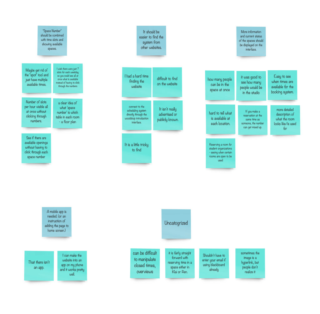
To collect the user feedback on the old version and their expectations for the next version, an online survey was sent out to about one hundred students across three departments. As a result, fifteen completed responses were recorded.

Based on the responses to the survey, most users make schedules on computers. The participants also provided their comments on the open-ended questions. To find the use needs and the design requirements, I used an affinity diagram to categorize the topics.
Affinity Diagram
Value Proposition
Based on the categorized themes on the survey analysis, the following value proposition was created that lists the expected features for the system.
- Make a reservation
- Check space information and current status
- View reservation history
- Receive email notification
- View space announcement
- Add the reservation page to mobile phone home screen
- Scan a QR code to open the reservation page
3. Low-Fidelity Design
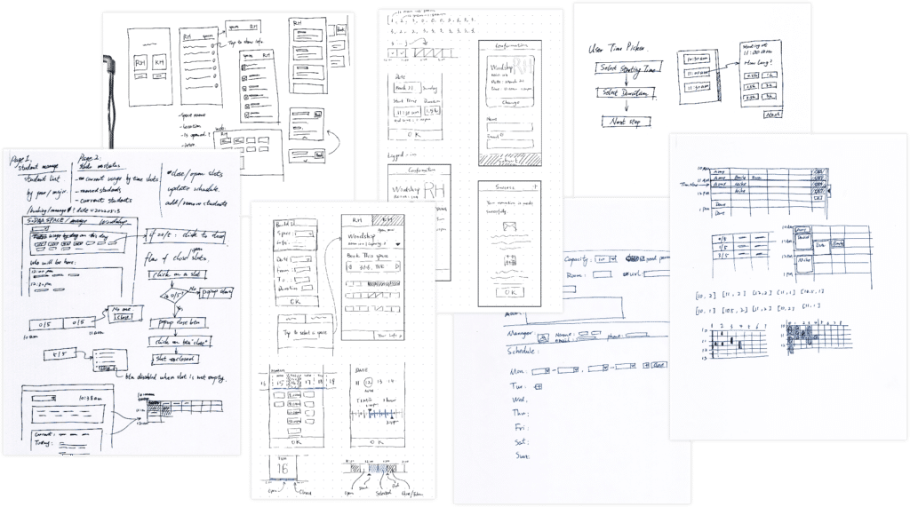
Sketching is my way of thinking. When the functionalities were confirmed, I started to explore elements and the interactions with a pen and paper. This helped me quickly produce the various solutions and document the design process.
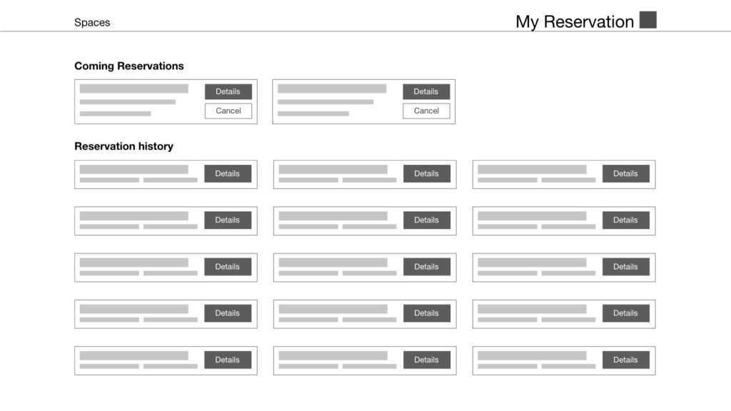
Digital Wireframes
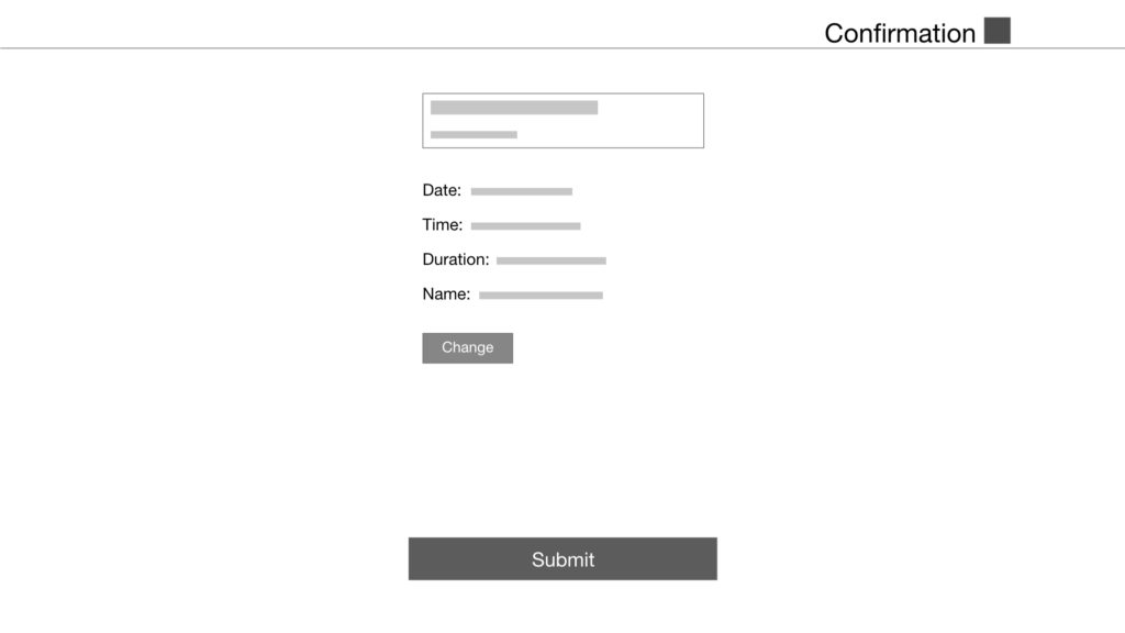
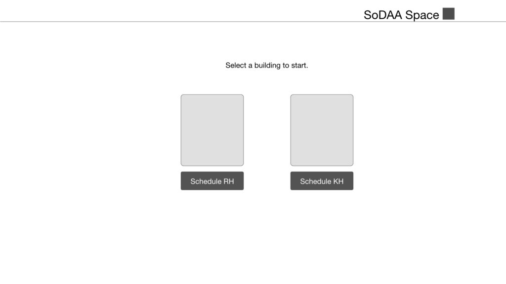
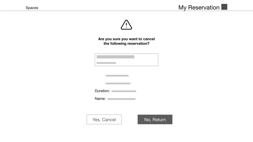
From the sketches, I selected the ideas that best met the design requirements and started to build the digital wireframe with Adobe XD. In this step, few details were considered so that I could test and iterate the design rapidly.
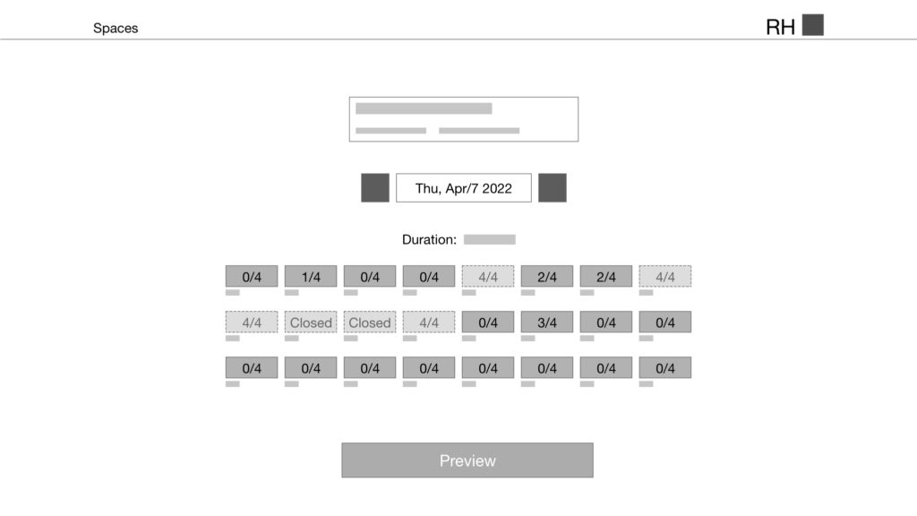
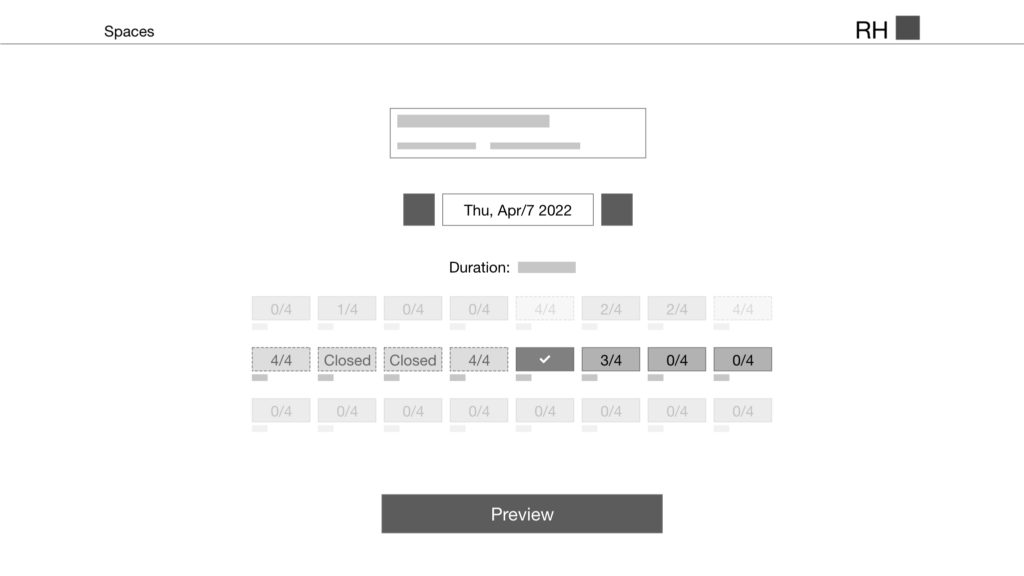
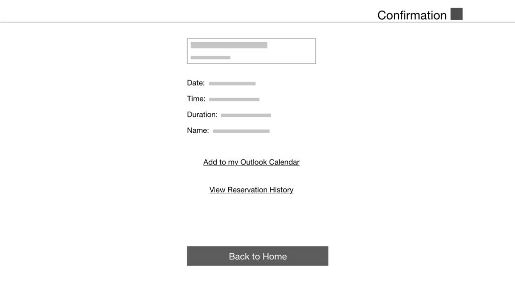
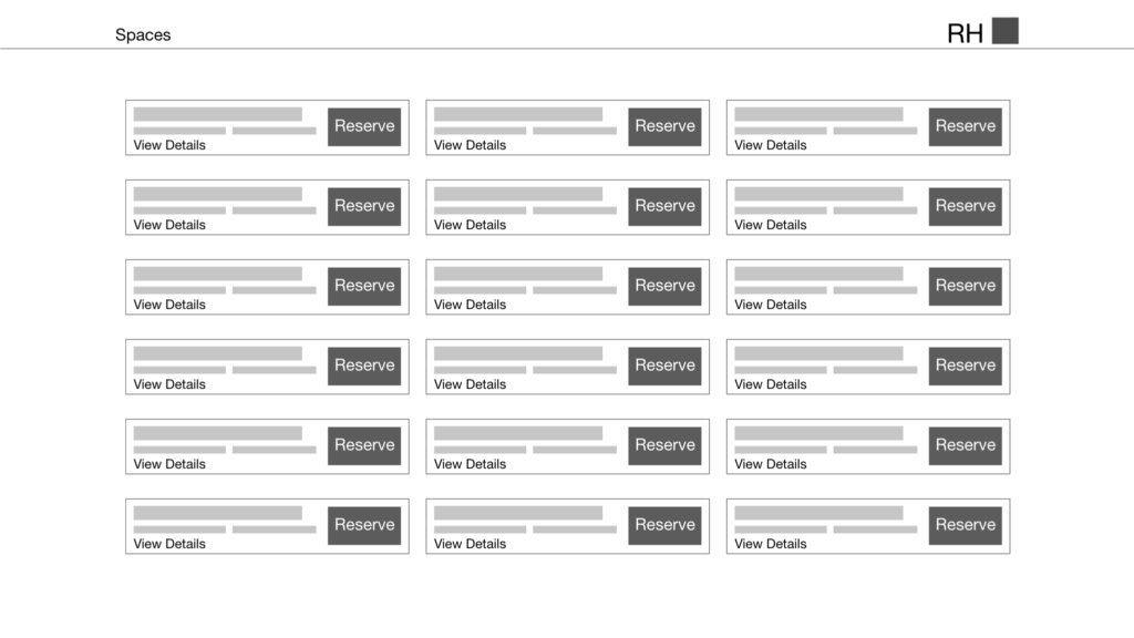
4. High-Fidelity Design
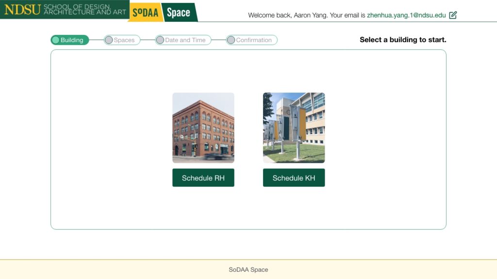
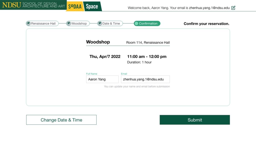
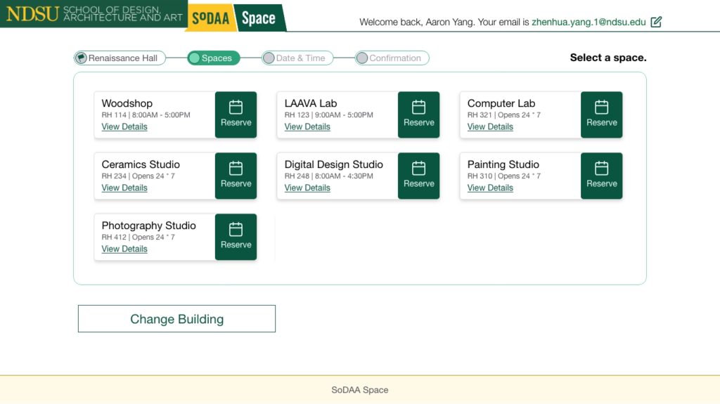
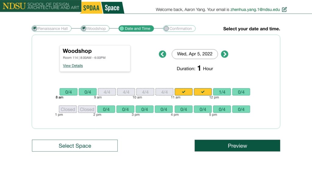
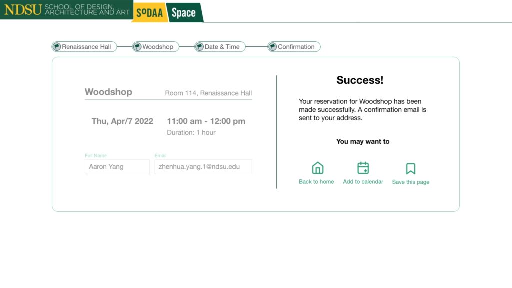
After some iterations on the low-fidelity design, I started to think about more details of the interactions and visual design.
Interactive Prototype
If the prototype is no loaded, please go to https://xd.adobe.com/view/008f7a57-7e17-4405-b009-bd37a01da70c-55dc/?fullscreen&hints=off.
Visual Design
5. Reusable Design Components
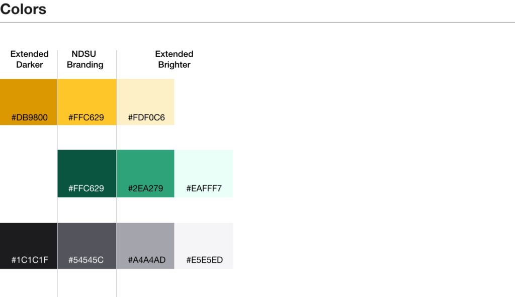
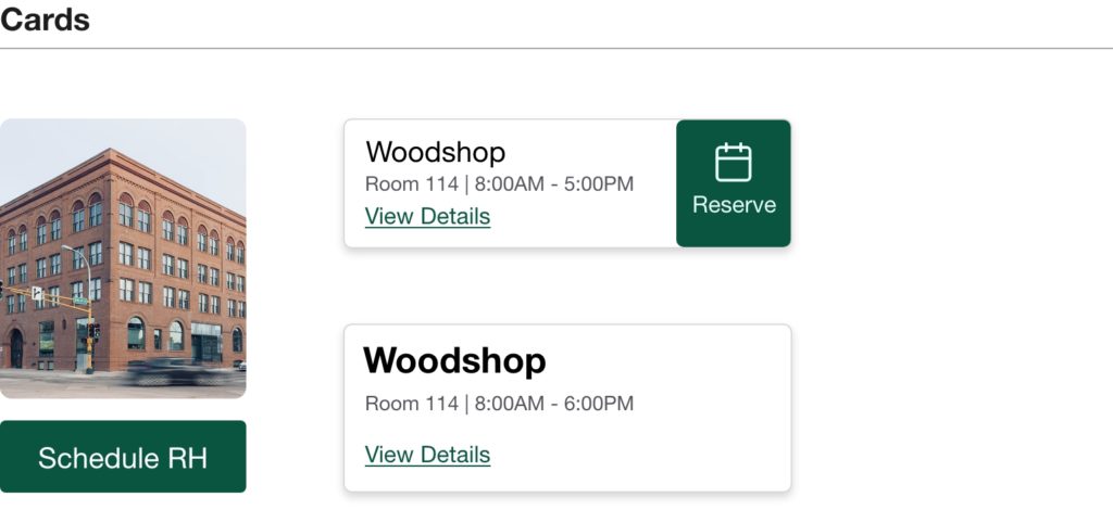
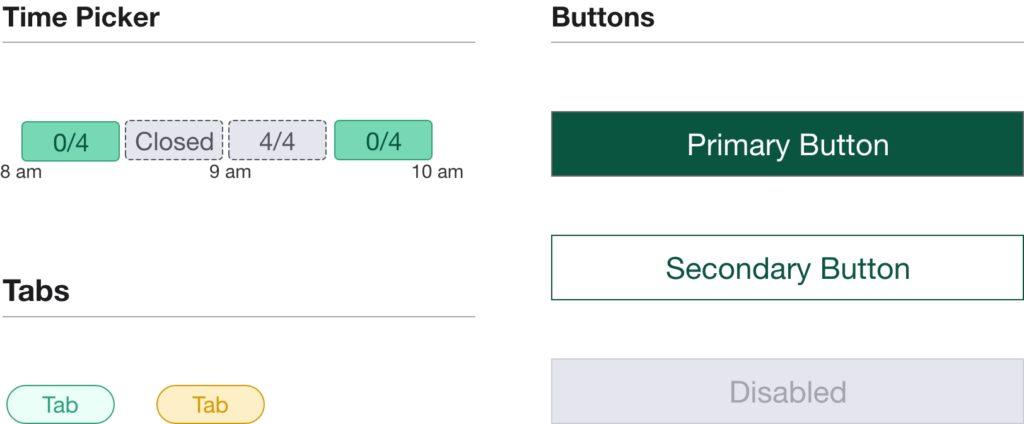
The reusable design components, or a design system, can help a team quickly extend the project and keep a consistent design language. At the end of the design, I created the color scheme and the basic UI elements, such as cards, buttons, and navigation. The creation of the design components also made the development more manageable and maintainable.

6. Implementation
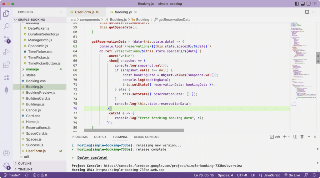
The system is being implemented with ReactJS, which is a UI-component-based framework. I have finished the major functionalities of the reservation page. I am applying visual design to the system. A demo project has been deployed on a web server. This is an incremental development. I will continue completing the manager and admin pages.
7. Future Work
Currently, Simple Booking has been proven to be successful by a small group that has about one hundred users in a design school. In the future, I plan to further optimize the system design and make Simple Booking a product that meets the needs of bigger user groups. The following tasks will be done:
- Conduct marketing research and extend the user scenarios.
- Create marketing positioning map and discover more benefit of Simple Booking over existing products
- Complete the system documentation and user manual to ease the maintenance.
Interested in a demo?
Please use the following information to try the system:
email: [email protected] | username: Demo User
or use the following link:
Other Featured Projects
ADL 1-2-3 Device
A gamified system that saves young patients’ lives by finishing daily hygiene activities.
eFargo: Energy-Saving Game
An interactive game that helps reduce energy use to fight climate change.
SoDAA Alumni Map
An interactive map that shows the alumni network of NDSU School of Design, Architecture, and Art.

