UI=User Interface
The layer where users interact with the machine.
UX=User Experience
How users feel when they are interacting with the UI.
Principles
- Hierarchy
- Contrast
- Consistency
1. Hierarchy
- Size – Users notice larger elements more easily.
- Color – Bright colors typically attract more attention than muted ones.
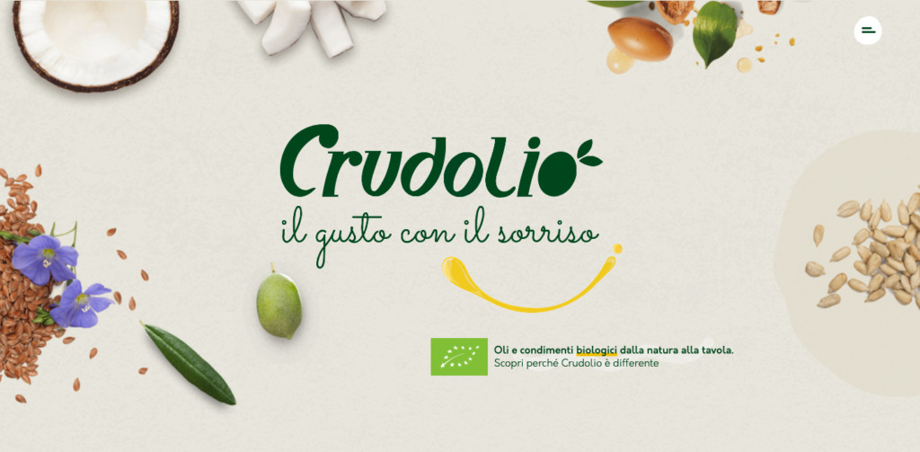
- Contrast – Dramatically contrasted colors are more eye-catching.
- Alignment – Out-of-alignment elements stand out over aligned ones.
- Repetition – Repeating styles can suggest content is related.
- Proximity – Closely placed elements seem related.
- Whitespace – More space around elements draws the eye towards them.
- Texture and Style – Richer textures stand out over flat ones.
Example
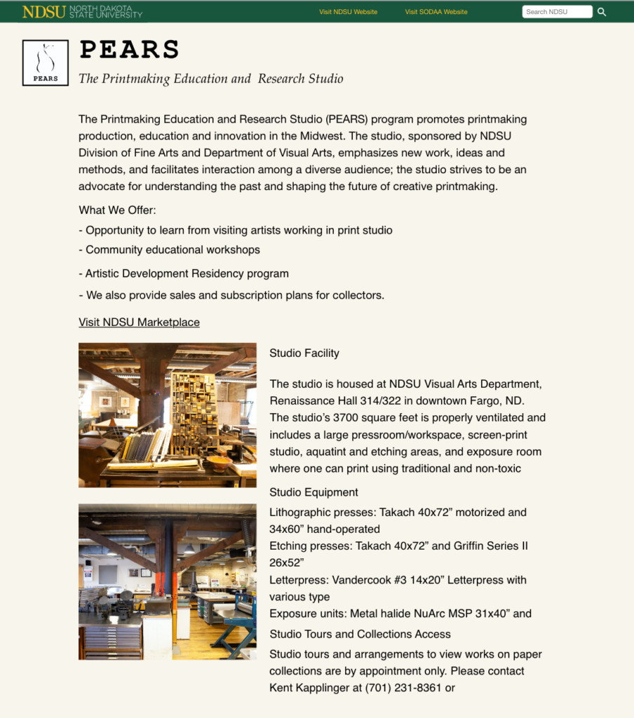
This is a web page. Or you could call it a document. In the body of the page, all the text has the same size and style. To find what it’s about, you must read the lines to find the keywords. However, the pure texts are not interesting. When people view a web page, they don’t read the text. They scan the page fast. In this case, you need to highlight the important words to help your users find where they are and what they need.

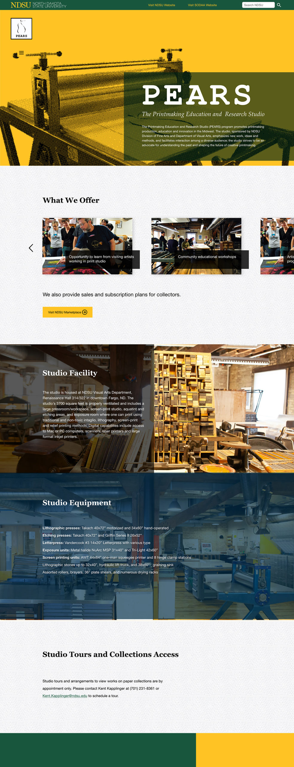
This is the completed design of the page. In the header, I used yellow in the background and big font size on the title “PEARS”. The Italic-styled text below it explains what the title means. If the users want to know more, they can continue reading. Otherwise, they may scroll down. In each section, the big heading draw people’s attention telling them where they are and what it is about. With headings, we broke down the page content into different visual blocks. Every time a user moves from one section to another, he/she focus only on one thing. By browsing the heading text, he/she could read the information he/she needed.


2. Contrast
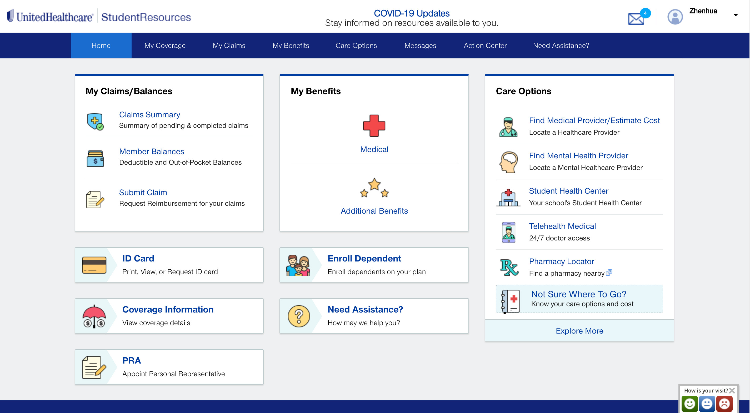
3. Consistency
- Color
- Style
- Typography

